INDUSTRY:
Healthcare
CLIENT:
K Health
YEAR:
2023-2025
EXPERIENCE:
Lead Brand and Marketing Designer
K Health — Brand System + Product UI
About
K Health began as a D2C healthcare platform offering one-time virtual visits across primary care, urgent care, weight management, and mental health. Before the redesign, the website relied on opaque circles, heavy navy backgrounds, and inconsistent bursts of peach, mint, and yellow, resulting in a visual system that felt dated, fragmented, and misaligned with the product’s evolution.
Challenge
The brand needed to evolve to support patient trust and communicate modern, AI-driven care without losing its approachable tone. The visual identity had to feel more sophisticated while staying clear across service lines (blue for primary care, green for urgent care, purple for mental health, and pink for weight management). The challenge was creating a system that felt warm, credible, and technologically advanced—all while unifying the experience across the entire website.
Result
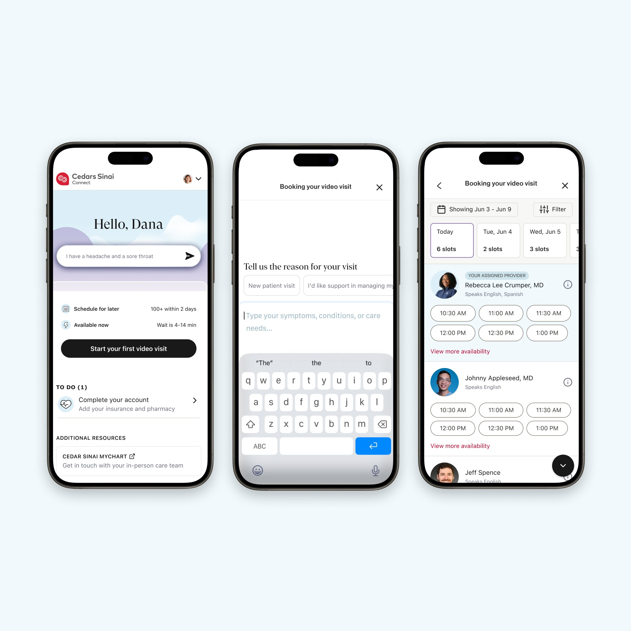
I expanded the visual system with contemporary graphic elements including glass-effect treatments, device-centric imagery, and UI-inspired layouts that reinforced the brand’s new AI capabilities. The updated system successfully blended innovation with empathy, resulting in a brand experience that felt modern, safe, and easy to trust—supporting both the company’s strategic shift and its growing product offering.
Testimonail <3
Emma is an exceptional brand designer who immediately elevated the K Health visual language. Her work pushed our product to a new level of clarity, cohesion, and visual impact.

Gaeb Cardinale
Director of Brand


